
Glossare
This project tackled on the idea of creating a one page website that tells a compelling story such as a brands narrative, a products journey, a personal tale or any creative narrative of my choice. Ultimately, the choice felt simple and it ended up being a website created to promote Chappell Roan’s newest single (at the time of creation), “The Giver”, whilst also showcasing her entire life and musical career so far (achievements, awards, songs released and more).

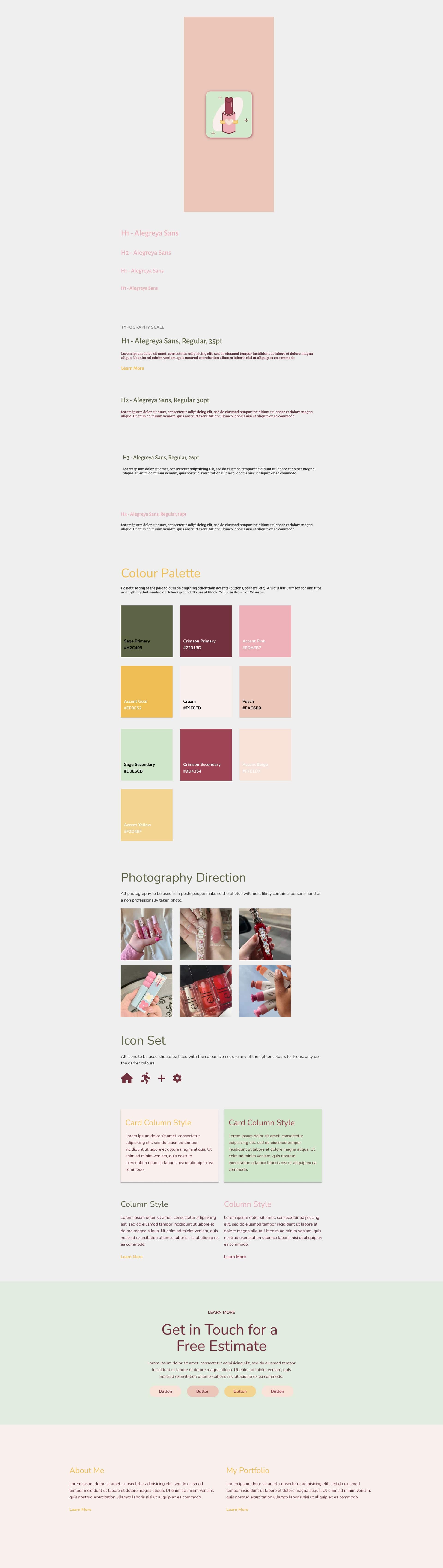
The design for the app was to create an inviting and safe space for users of all races, sexualities and genders to interact with one another and feel comfortable asking for help. The goal was to create a personalized experience with real people having tested products in the past in order to make the responses as accurate as possible. The overall layout was supposed to resemble social apps such as Instagram, Twitter and Pinterest whilst also being its own thing and living within its own category (said category did not exist prior).
Roles
Research
Researching similar apps
Looking up the target demographic
Concept
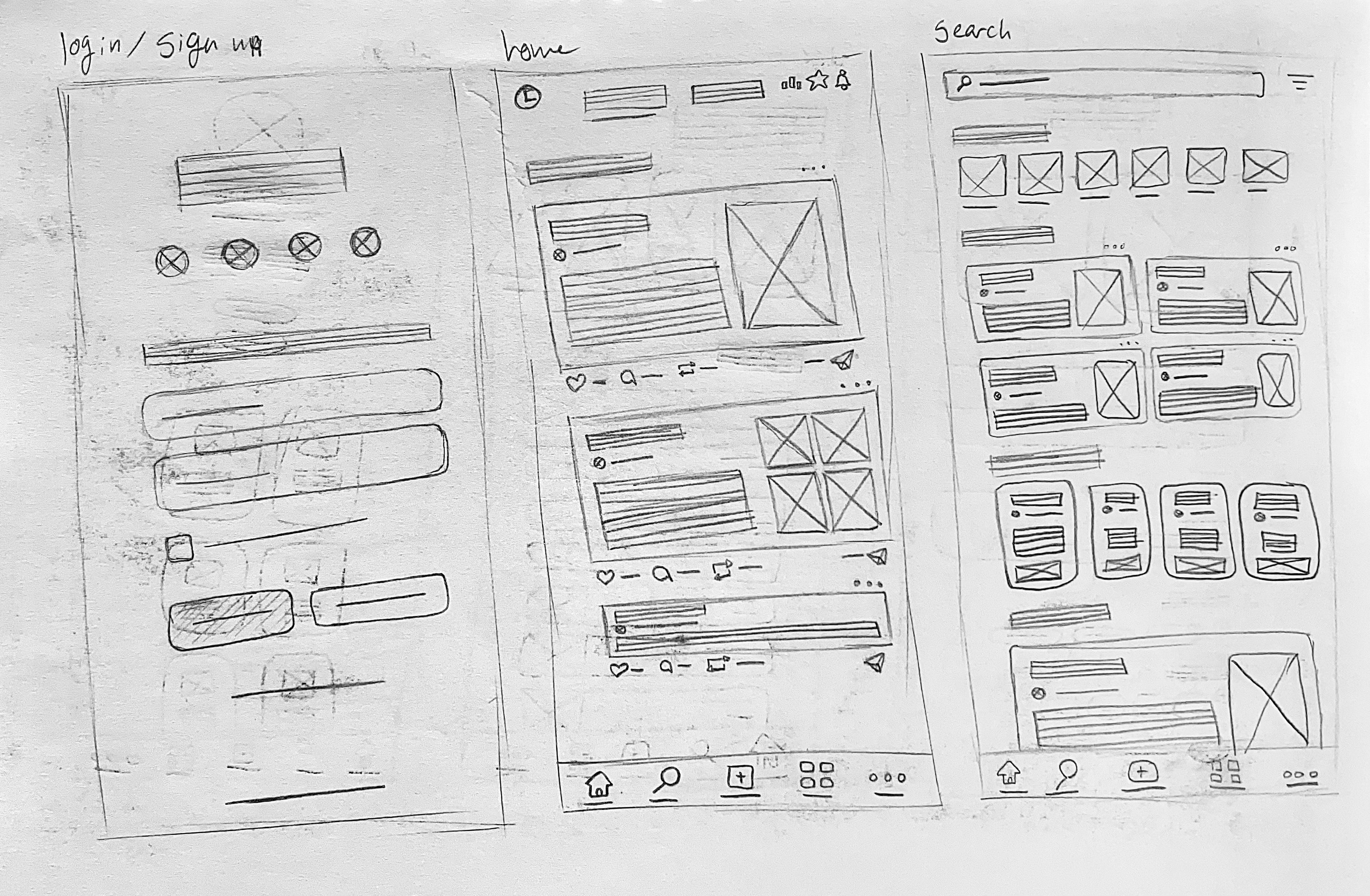
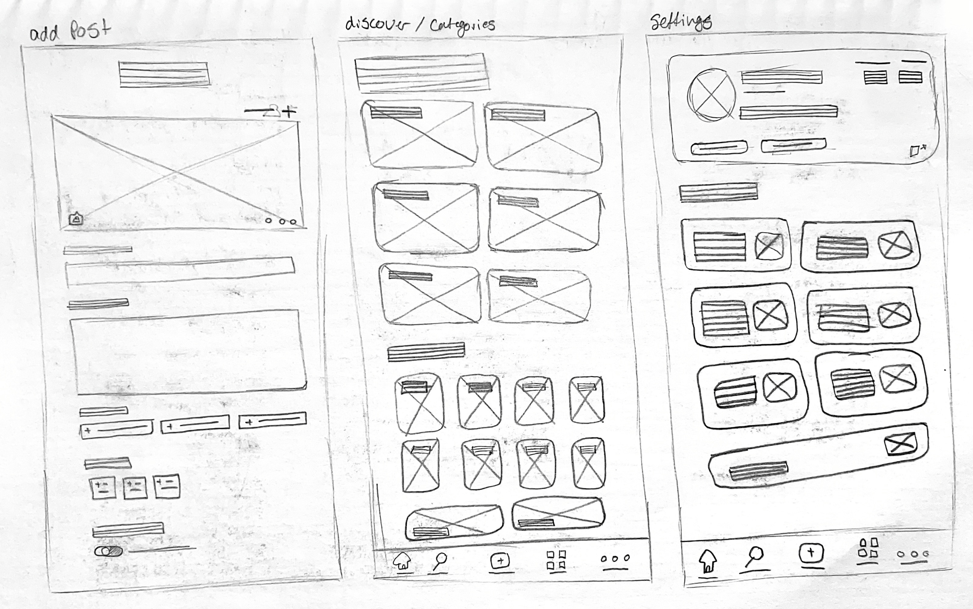
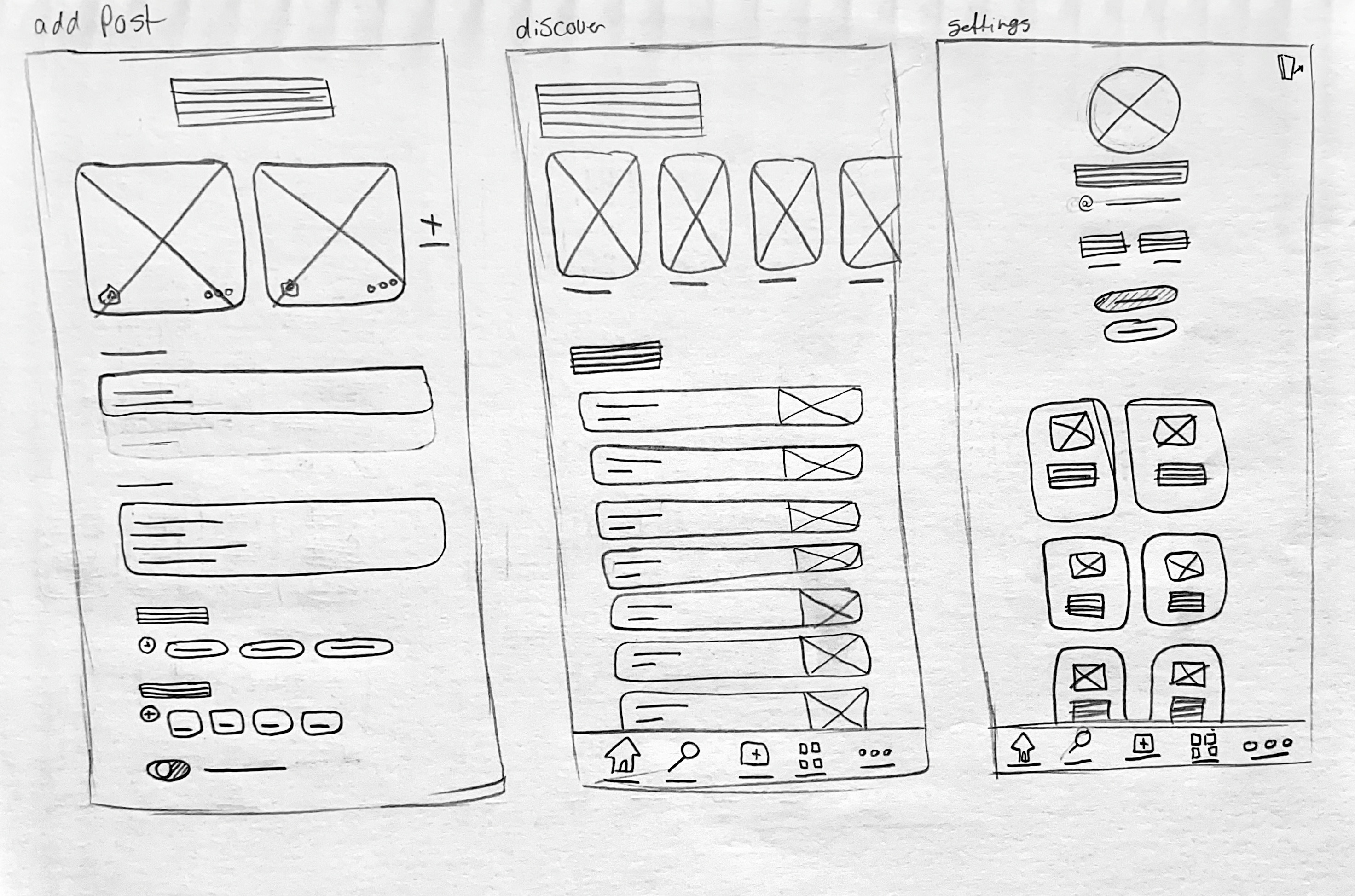
Sketching out potential layouts and forums
Conceptualizing low and high fidelity wireframes
Design
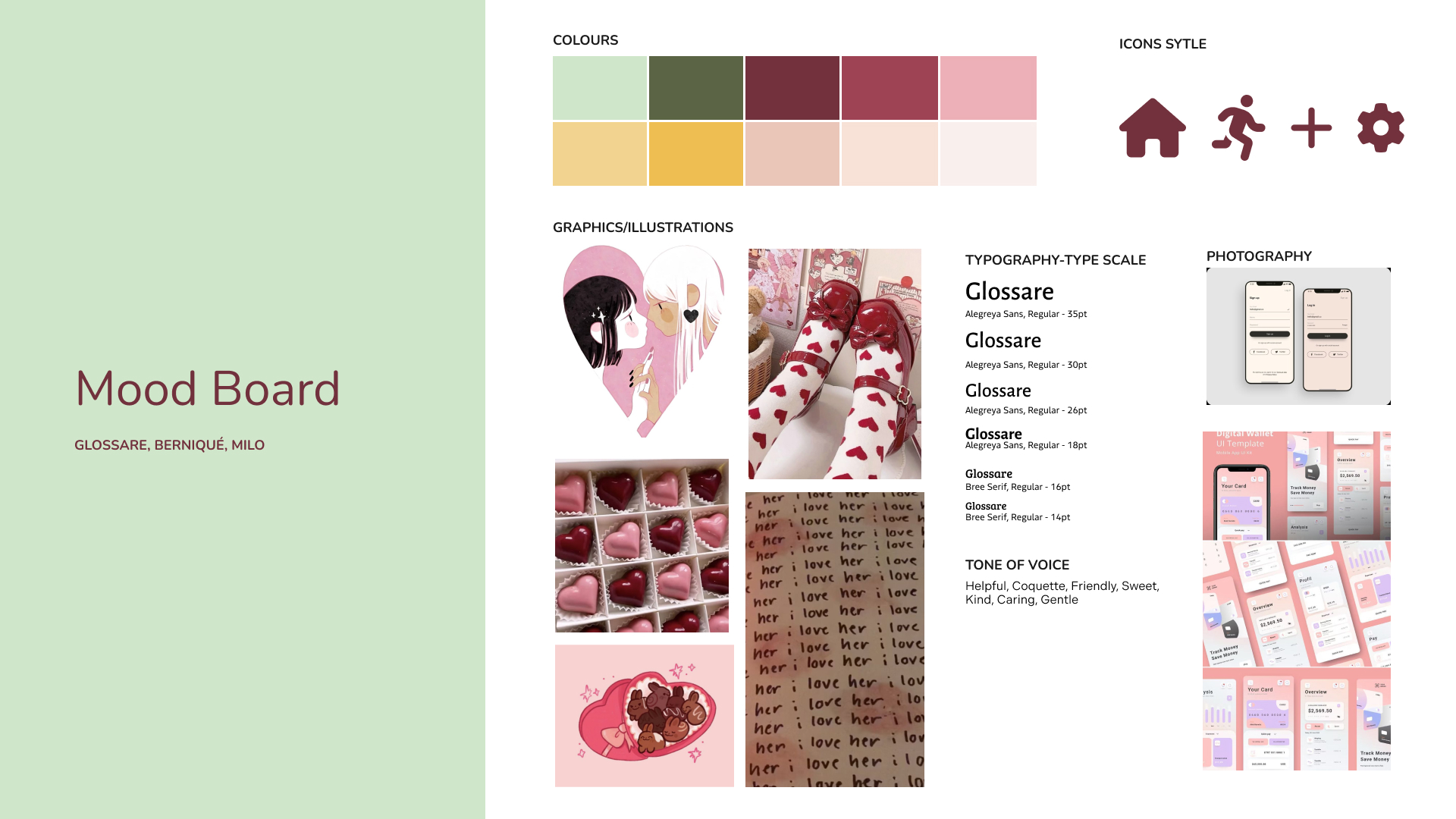
Choosing colours and making sure they contrast
Arranging information in a visually appealing way
Prototyping
Building frames in Figma
Organizing the information correctly using grids
Adding transitions and interactions where needed
Research
During the research period for this project, I zeroed in on looking into apps for the target demographic which lead me to finding nothing of the sorts. From that point on, I looked into social media apps that had a layout that allowed to communicate with other users as well as apps with a layout of forums. This allowed me to utilize the layouts and incorporate elements that would create a platform easy to navigate while also allowing users to ask other people for help.
Final Look
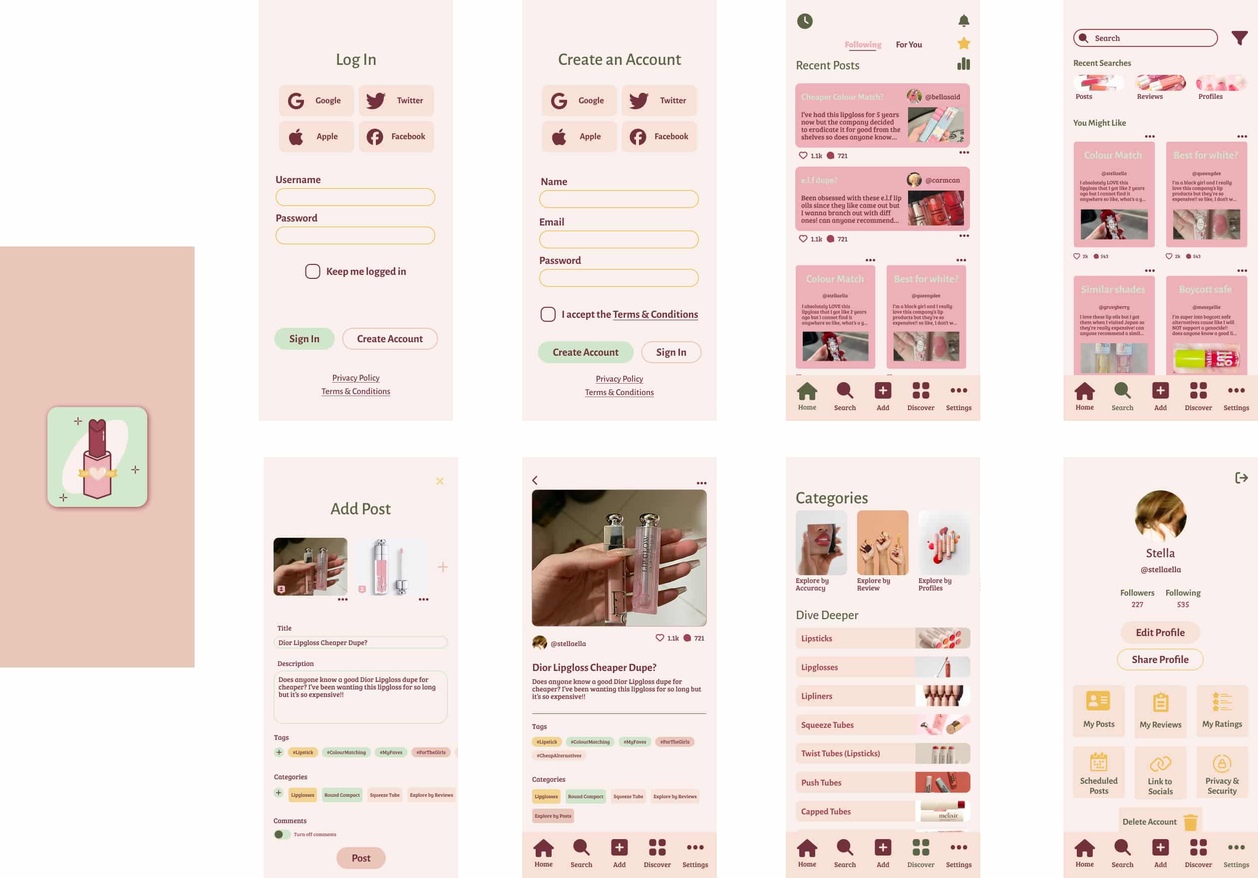
I received constructive feedback from peers when presenting the product such as how to make things more accessible by creating bigger contrasts within the colours and making the test bigger and more readable. I feel I was able to strengthen my component creating skills as well as being able to better my layout design skills due to the intricacy of the overall finished product of the app.
